Amway Business Analytics Platform
Led the UX and product design for a centralized business analytics ecosystem that helped operational and business teams transform complex data into actionable insights through intuitive dashboards, simplified reporting experiences, and scalable enterprise analytics workflows.
Overview
Product Vision
The goal of this platform was to simplify enterprise-level analytics and help business teams make faster, data-driven decisions through a centralized reporting ecosystem. The existing reporting experience was fragmented across multiple tools and lacked clarity, scalability, and usability.
As the lead product designer, my responsibility was to redesign the analytical experience from a usability and business perspective — transforming complex datasets into structured, intuitive, and decision-focused dashboard systems.
Step-1
Understanding Key Challenges
During the discovery phase, I analyzed how different business teams interacted with analytics and reporting systems. One of the biggest challenges was that users had to navigate multiple disconnected dashboards to access operational insights.
- Disconnected reporting systems across departments
- Lack of centralized business visibility
- Complex data visualizations difficult to interpret
- Manual reporting workflows slowed decision-making
- Dashboard experiences lacked usability consistency
- Users struggled to identify actionable business insights quickly
Step-2
Defining Business Objectives
The business needed a scalable analytics ecosystem that could centralize operational reporting, improve visibility, and help teams make faster business decisions using real-time insights.
- Centralize all analytics into one platform
- Improve accessibility of business insights
- Reduce dependency on manual reporting workflows
- Improve KPI visibility across departments
- Enable faster business decision-making
- Create scalable dashboard systems for future growth
Step-3
Research & Analytical Insights
I collaborated closely with business analysts and stakeholders to understand how users consumed data and what prevented efficient analytical workflows.
- Users preferred simplified dashboard experiences
- Complex chart structures created cognitive overload
- Teams needed faster access to actionable insights
- Clear KPI prioritization improved usability significantly
- Different teams required customized analytical views
Step-4
UX Strategy & Dashboard Thinking
Instead of designing visually heavy dashboards, I focused on simplifying the analytical experience through structured information hierarchy, cleaner visual systems, and usability-focused dashboard layouts.
- Prioritized business-critical KPIs first
- Simplified complex reporting structures
- Reduced cognitive overload through visual hierarchy
- Designed scalable modular dashboard systems
- Improved navigation between analytics modules
Step-5
Information Architecture
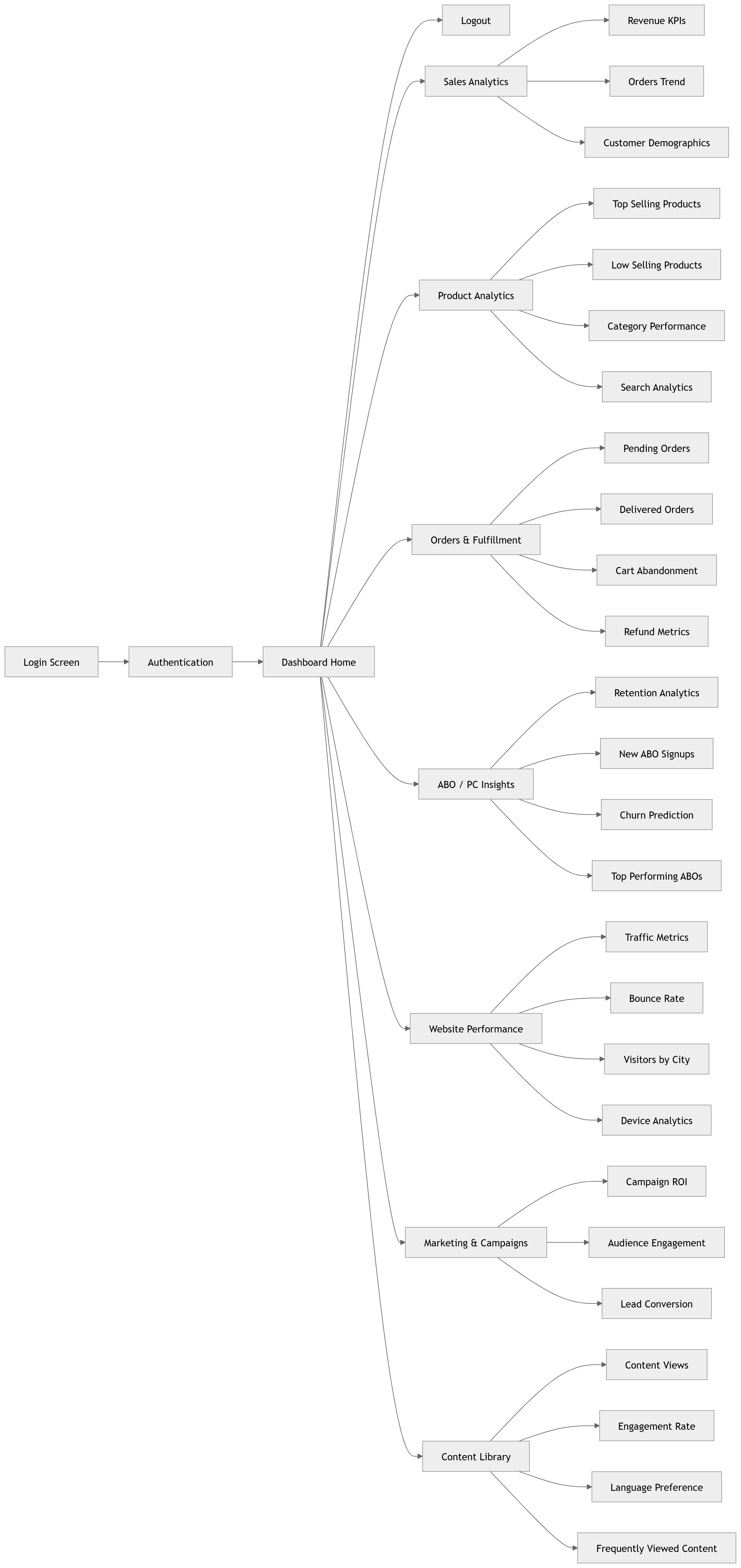
Reorganized the reporting architecture to improve discoverability, dashboard navigation, and analytical workflow efficiency across teams.
Step-6
Design Exploration
- Explored multiple dashboard layout systems
- Iterated KPI card structures and chart visualization patterns
- Focused heavily on minimal and clean analytical interfaces
- Simplified dashboard navigation and filtering experiences
- Refined usability through iterative stakeholder feedback
Step-8
Final Solution
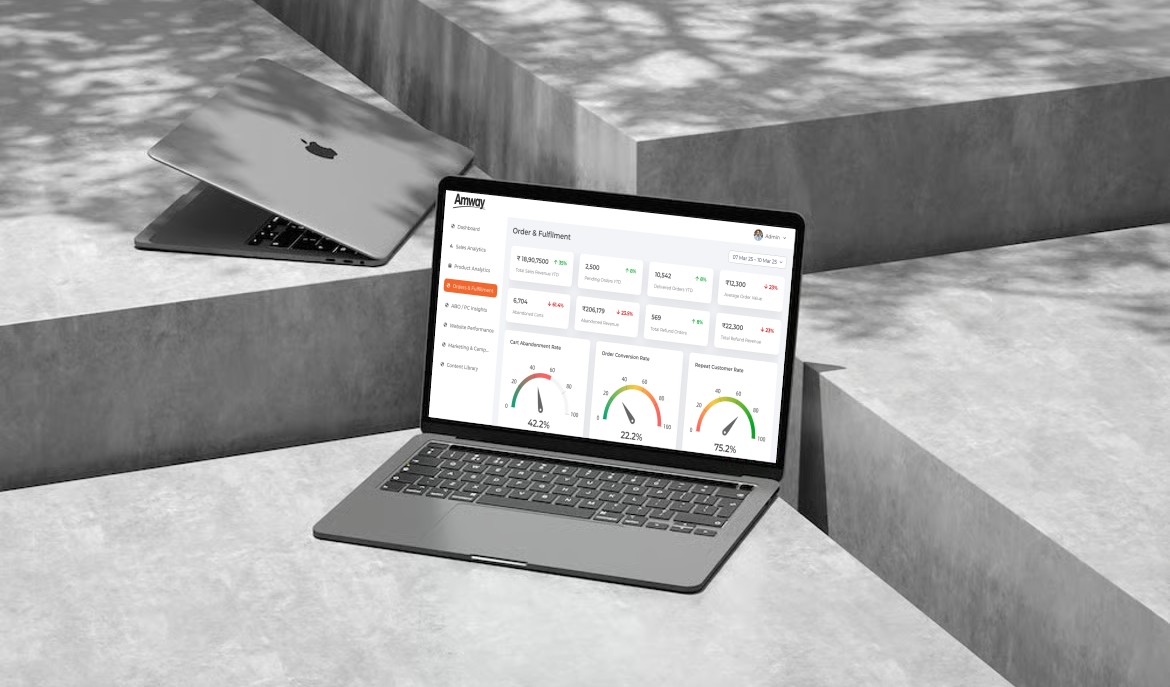
The final analytics ecosystem helped teams access operational insights faster through centralized dashboards, simplified reporting systems, and intuitive data visualization experiences.
- Unified analytics platform across departments
- Simplified reporting and dashboard usability
- Improved accessibility of business insights
- Reduced dependency on external reporting tools
- Enabled faster business decision-making
Step-9
High Fidelity Screens
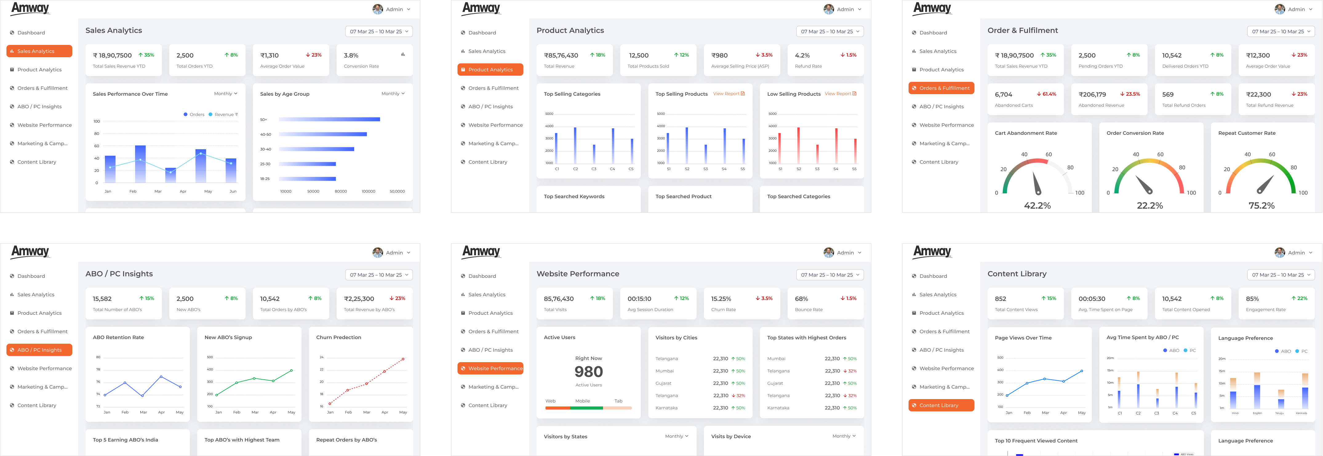
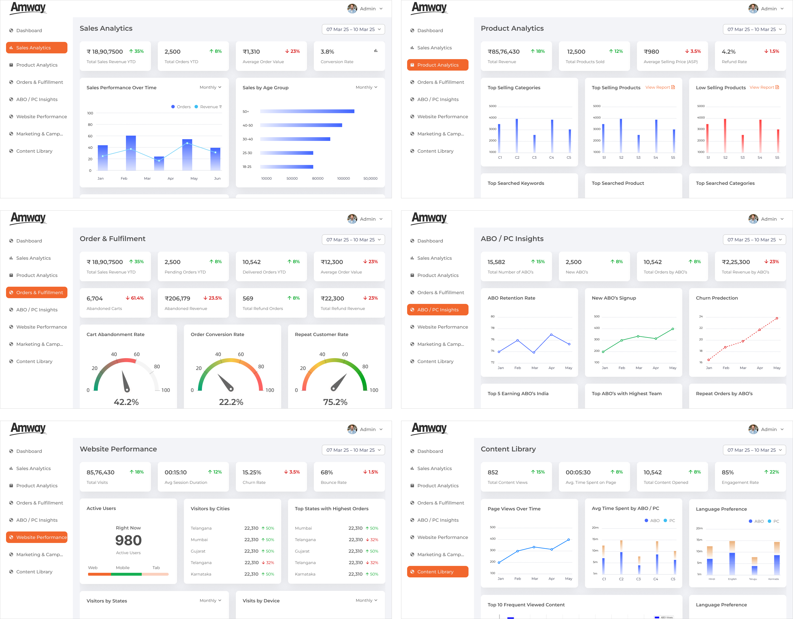
Below are some of the key dashboard and analytical experiences designed for the platform including KPI dashboards, performance tracking systems, reporting modules, operational analytics, and business intelligence workflows.
My Contribution
Leadership & Collaboration
As the Lead Product Designer, I worked closely with business stakeholders, developers, and analytics teams throughout the project lifecycle to ensure the final platform aligned with both usability goals and business requirements.
- Led end-to-end UX and UI strategy
- Conducted stakeholder workshops and dashboard reviews
- Simplified enterprise analytical workflows
- Built reusable dashboard systems and UX structures
- Collaborated with developers for implementation support
- Conducted regular design QA and validation reviews
Business Impact
Outcome & Results
From a business perspective, the platform significantly improved how teams interacted with operational data and business insights. The new analytical ecosystem reduced reporting inefficiencies, improved dashboard adoption, and enabled faster decision-making across multiple departments.
40-50%
Reduction in manual reporting effort30-40%
Faster business decision-making25-35%
Improvement in data visibilityIncreased
Dashboard adoption across teamsReduced
Dependency on external toolsAI Integration
AI-Assisted Analytics
Explored AI-assisted reporting experiences including smart insight recommendations, automated analytical summaries, and predictive data support to help users consume business insights more efficiently.
Learnings
Key Takeaways
- Strengthened expertise in enterprise analytics UX
- Learned how to simplify complex data ecosystems
- Improved understanding of dashboard usability psychology
- Enhanced skills in scalable enterprise design systems
- Gained deeper experience in business-driven product thinking